Shelf appeal - Packaging that tells an authentic story and that sells itself
How to use your brand’s history and assets to create an authentic and compelling narrative.
Design studio 93 was approached by Chatsworth, a stately home nestled in the Derbyshire Peak District, to design a range of premium biscuit packaging to launch their new range of kitchen garden inspired biscuits.
Chatsworth is known for their dedication to sustainability and commitment to supporting local businesses within 30 miles of the Chatsworth estate. Completed in 1708, Chatsworth is rich in history with archives which are still being discovered to this day. So, for brands with a history - like Chatsworth, filtering through decades or even centuries worth of archive materials to arrive at a clear and compelling narrative that really works can feel like a substantial piece of work.
The anatomy of great product design - how to design packaging that really works
An impeccable product is always our starting point. This was something that 93 recognised as vital to the success of the project. We must have a great tasting biscuit that Chatsworth can call their own.
Chatsworth reached out to Peak District based Artisan Biscuits, who have been hand baking biscuits for over 100 years. Based on the vision of the team at Chatsworth we worked together to draw inspiration from the kitchen garden at Chatsworth.
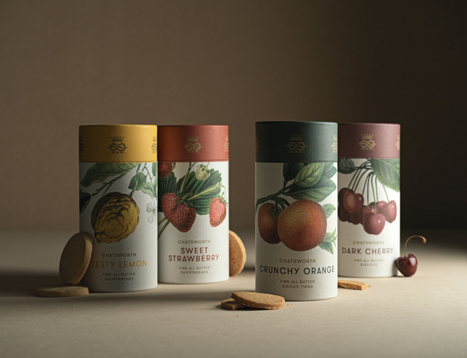
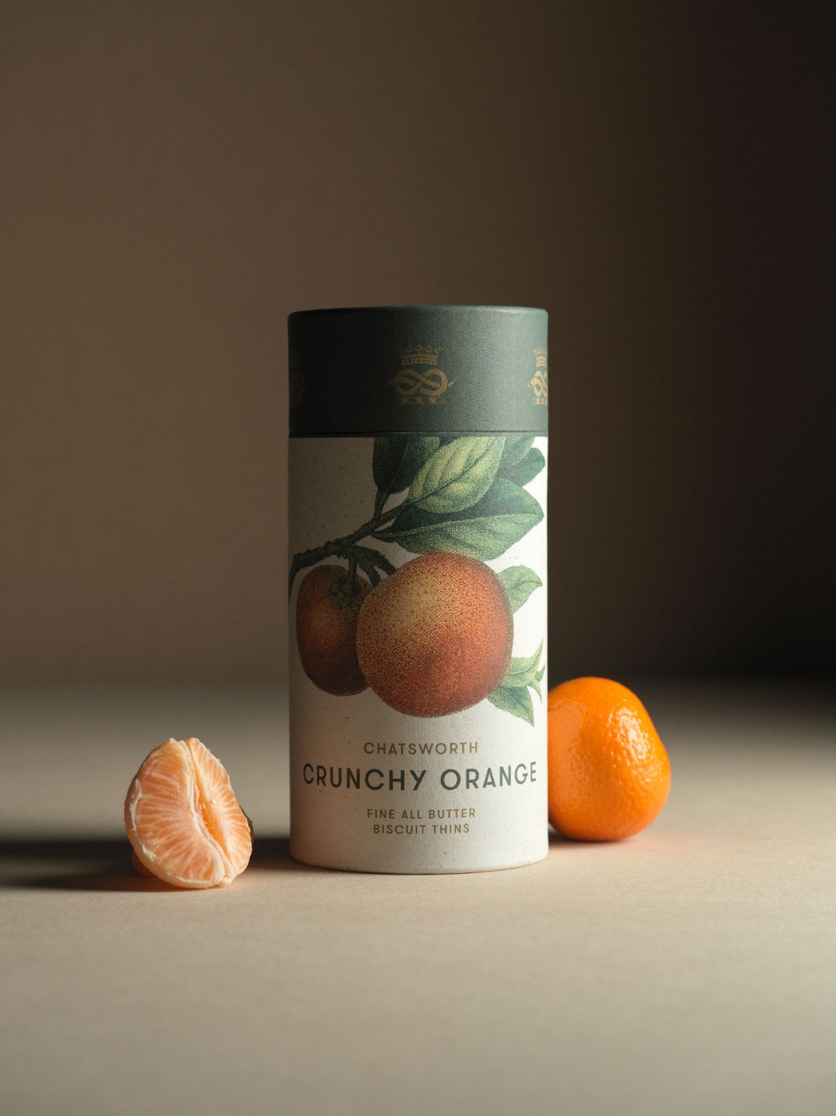
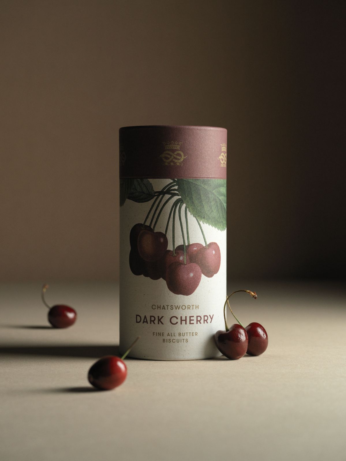
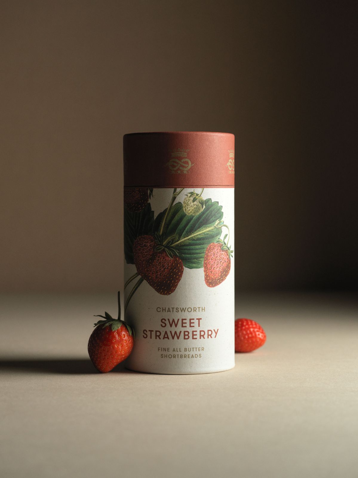
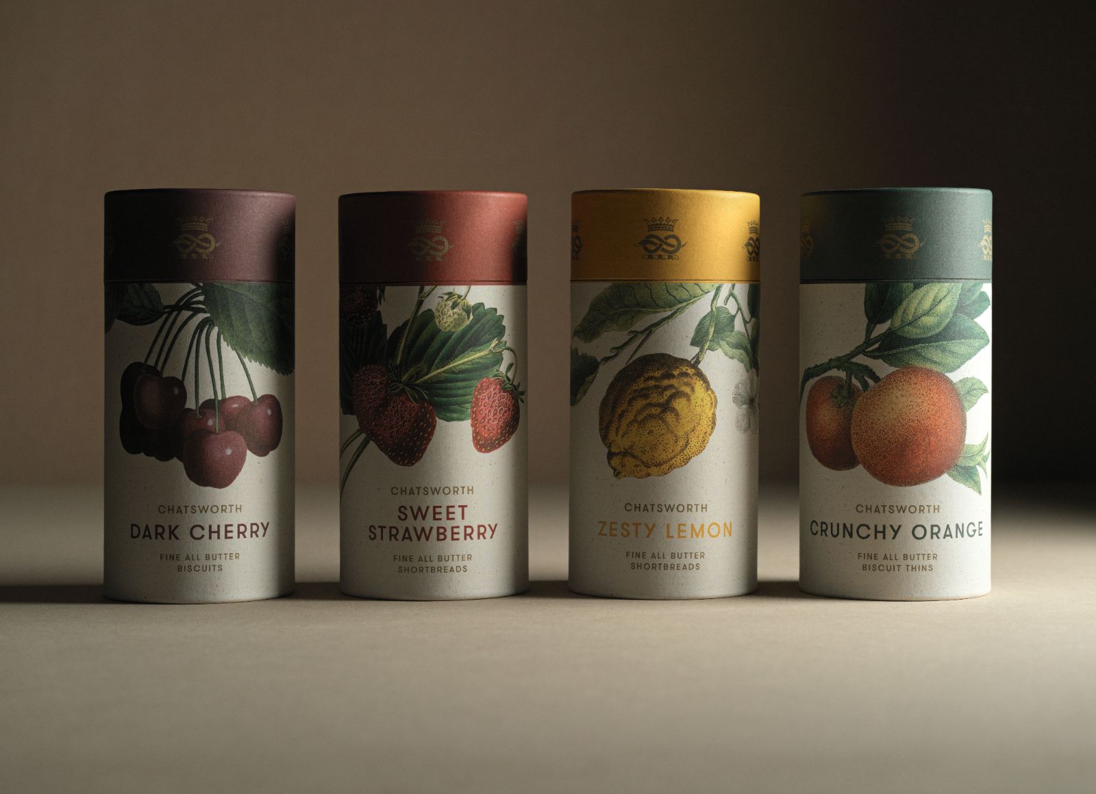
Esteemed biscuit makers, Artisan Biscuits helped to develop a new range of biscuits that included favourites such as Zesty Lemon and Crunchy Orange, as well as new flavours such as Dark Cherry and Sweet Strawberry. Each flavour of biscuit was baked by hand, practically on Chatsworth’s doorstep.
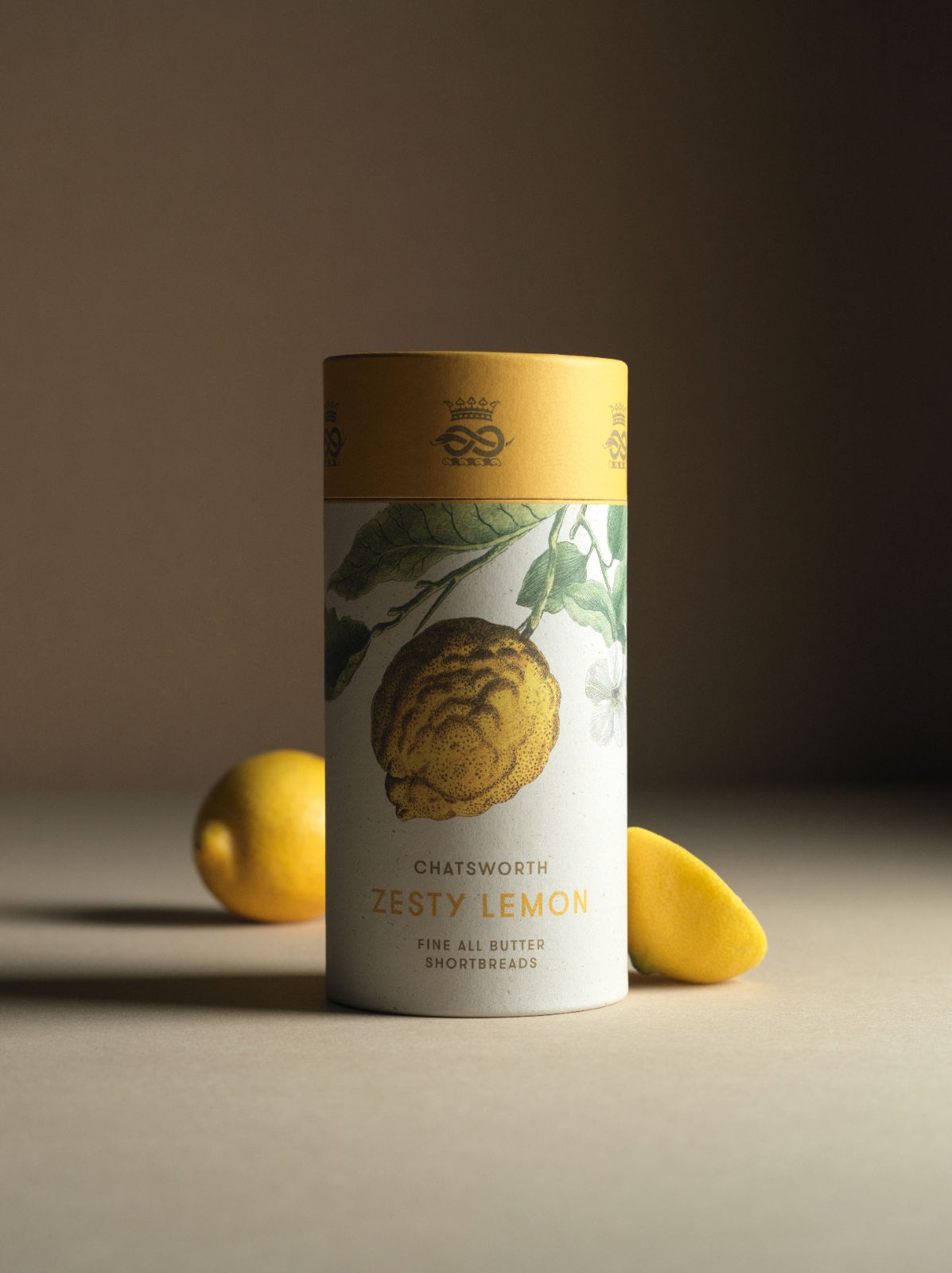
Inspired by the history of the kitchen gardens at Chatsworth, the Zesty Lemon biscuit takes its inspiration from the Imperial Lemon - a tree found in the great glasshouses at Chatsworth - beautifully tying the estate’s long history of food production to the present day and contributing to the authenticity of the modern heritage narrative we wanted to share with a wider audience.
Shelf appeal, from first impressions to the practical details, is all important for products that need to sell themselves.
A piece of Chatsworth to take home
We wanted to create an authentic product that caught the eye, that reached out to be taken home by some of Chatsworth's 600,000 annual visitors. We aimed to design the perfect gift, as fitting to take home as a memento of the day - your piece of Chatsworth - as it would be gifted to someone special, without even needing to be wrapped.
With this in mind, we helped bring various aspects of the house and gardens into the design, using botanical drawings from Chatsworth’s archives, an original engraving of the house itself and a succinct narrative that told a story.
Making it all stack up
Using a vertical format for the packaging helped to ensure retail shelf space was maximised, making it easier and more efficient to get more products onto the shelves. The vertical format also allows the full front of the packaging to be viewed by the customer.
Visual merchandising is an important part of retailing any space. It’s what guides customers to a standout product - a must have and ultimately can assist the customer in making a decision to part with their cash. So we created a highly visual packaging design that takes care of its own visual merchandising, allowing the retail team to focus on other areas of the shop.
Putting the values of the brand front and centre
The voice of a brand consists of many things but perhaps the most important aspect it needs to convey is its principles. Consumers are becoming more aware, more willing to ask hard questions, to delve into the behind the scenes of a business or product, and more ready to shop elsewhere if they don’t like what they see. Ensuring that the ethics underpinning a business’ practises are clearly translated through their branding has never been more important to get right.
We wanted to make Chatsworth’s commitment to sustainability clear at first glance by making the packaging tube and biscuit tray entirely from uncoated paper so it’s easier to recycle, and beautiful enough that people can reuse it again and again. It’s also a unique selling point, that helps to differentiate a Chatsworth product from a competitor. As a team we opted out of metal capped tubes, gloss and plastic finished wraps. The only plastic represents the air-sealed bag helping keep the biscuits fresh.
We opted against using printing foils as, although this would’ve added a feeling of opulence to the packaging, mixing materials makes recycling more difficult. This is just one example of how Chatsworth actively demonstrates their environmental values.
A team of creative experts to guide you
Packaging projects can involve months of work, so it’s important to avoid decision making paralysis amongst the project team. These can be decisions involving creative direction, colour, legalities or artwork production proofs, so it’s important to avoid any loss of momentum. Together we can help ensure that the lead time from idea generation to launch is as tight as possible.
Modern heritage - creating a brand as rich in history as it is relevant to the present time
Britain is a country incredibly rich in history - a history which holds a fascination, nostalgia and delight for our citizens and those overseas alike. Making the most of this history, enabling visitors to experience it with all their senses, was the key to creating a successful retail product to experience in store.
We wanted to create something which spoke volumes; packaging that didn’t even need to be picked up to show it’s something special. We wanted to create a product that felt intrinsically Chatsworth, while staying firmly rooted in the present. Indulgent in the nostalgia for artisan methods of the past backed up by modern day design sensibilities.
We were privileged to be granted access to the Chatsworth archives - a stunning array of materials ranging from books, papers and historic journals. Some of these provided the inspiration for the botanical imagery reproduced on the packs. We chose botanical and scientific drawings of fruits, some of which were grown in the kitchen garden of Chatsworth. The creative team added a sympathetic colour palette that complimented the imagery without overpowering it, looking as though it could have been hand painted by the botanists of the day.
We created four individual packaging designs for Chatsworth’s new range of artisanal biscuits for sale online and in store
A key consideration was to ensure a global appeal to those visiting the online store via Chatsworth’s online gift shop as well as in store. We refined the historic Devonshire coronet by redrawing and modernising elements to improve legibility and reproduction on the packaging.
We wanted to portray the kind of ‘modern heritage’ which translates well into any environment. A strong typographic style and considered use of colours compliment the Chatsworth brand and creates understated shelf appeal that communicates across generations.
We married effective creative design with the authenticity of a compelling narrative, evoking the estate’s former kitchen gardens history through a narrative told on the reverse of each pack.
Creative direction from planning to successful launch
Months of planning culminated in an incredibly successful launch week at Chatsworth. Within weeks, the initial order of biscuits had sold out, far exceeding expectations.
We wanted to capture the biscuit range in a fresh and modern way that felt like a part of Chatsworth. Working with photographer, set designer and director Adam Barclay, based in Kelham Island, Sheffield, we achieved just that. Adam has created images for Wallpaper* Magazine, Cereal Magazine, Issey Miyake and De Beers Diamonds, to name a few, and his product photography instils a warmth and nostalgia that we hoped to achieve, inspiring a new audience at home and abroad.
To discuss your brand's product or packaging design, just get in touch
Latest Projects

Heywood Hill - The power of design, print and direct marketing
Heywood Hill have been widely regarded as London’s Literary Lighthouse for curious bibliophiles all over the world. 93 helped Heywood Hill to elevate their brand and reach their target audience designing a sales catalogue promoting their extra ordinary modern books.
Find out more![]()

Colemans Deli - Building a website using the Square app
93 worked with Colemans Deli, an award winning café set in the heart of the Peak District, to create a website that integrated seamlessly into their existing system
Find out more![]()

Clarke & Roskrow Opticians - Creating a modern traditional British shopfront
When Market Harborough optician Clarke & Roskrow wanted to elevate their high street store fascia to get more impact and attract more customers, they invited 93 to answer their design challenge.
Find out more![]()

Hairpin House, Digbeth - BTR rental apartments and community living, to call your home
Explore how our design team, turned the fortunes of Birmingham's former hairpin factory into a new build-to-rent development in the heart of Digbeth.
Find out more![]()
Special Recognition


